1.2 The Xynk Window
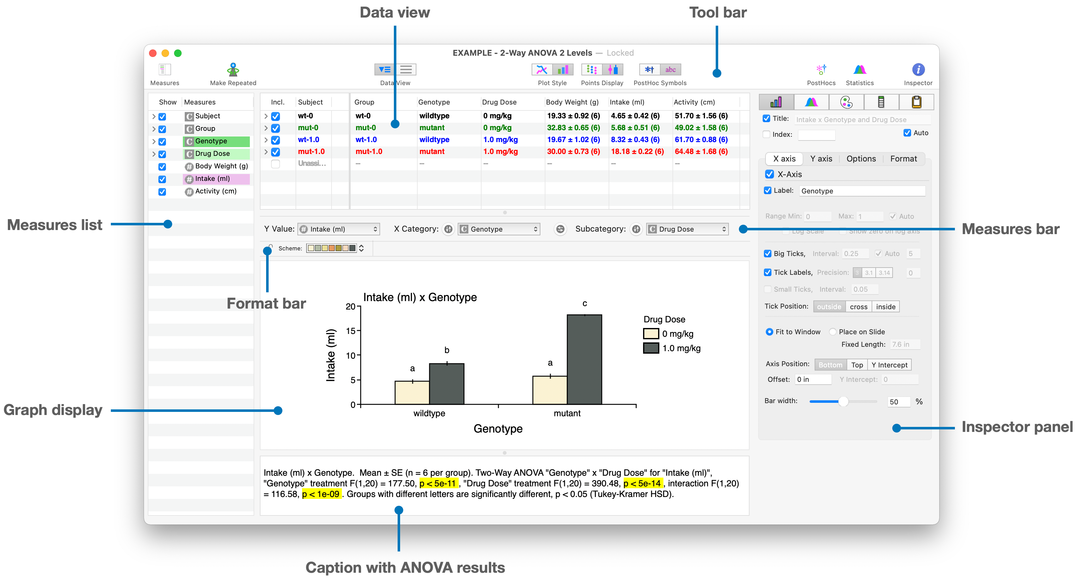
Tool Bar
Quick short cuts are available in the Tool Bar to change common plotting parameters (e.g line vs bar graph, individual points, post-hoc symbols) or reveal other views (e.g. statistical results table).
Data View
A spreadsheet view of the data used for graphing and analysis: each row is a different subject, each column is a categorical or numeric measure, so each cell is the value of that column's measure for the row's subject. The data can be viewed as a flat table, or with the subjects sorted into their respective Groups.
Measures Bar and Format Bar
The X- and Y- axes of the current graph can be set by selecting the Y-Value measure and the X-axis category and subcategory with the Measures Bar dropdown menus.
Immediately above the Graph Display is a Format Bar, which shows the options for reformatting a selected graph or graph element (eg. color scheme, line width, font characteristics, etc.)
Graph Display
Here the graph is plotted using the selected Y-value and X-categories. By default the graph scales with the size of the window, but you can also fix the size of the graph in the Inspector Panel to remain constant.
A key feature of Xynk is that most of the plotting parameters in the Graph Display applied to the current graph are carried over to any other graphs in the file which are plotted with other data in the file, making all your graphs have a consistent look and feel.
Caption with ANOVA results
Xynk automatically calculates an ANOVA for the selected graph, and lists the overall results and labels the post-hoc comparisons in the Caption Panel; this text is designed to be copied and pasted directly for use as a figure caption.
Measures List
The measures in the file (ie the columns in the data view) are also shown in the Measures List on the left sidebar. A measure to be plotted (numeric ![]() for y-values, categorical
for y-values, categorical ![]() for x-values ) can be selected by clicking on the individual measure in the list. Subcategories of categorical measures can also be seen by clicking on the disclosure triangles; subjects within subcategories can be excluded/included by clicking on the checkbox.
for x-values ) can be selected by clicking on the individual measure in the list. Subcategories of categorical measures can also be seen by clicking on the disclosure triangles; subjects within subcategories can be excluded/included by clicking on the checkbox.
Inspector Panel
Xynk tries to be intuitive with quick and easy ways to change graph format and analyses. The Inspector Panel on the left lets you drill down and tweak all the detailed settings to determine the look of graphs, axes parameters, statistical test details, etc.